Last Updated on December 10, 2025
We live an American Foursquare home – and I’ve grown to love this house style. Known for their simple and practical design, the Foursquare home has this amazing ability to adapt to various styles while still keeping its character. But these old houses can commonly be on the smaller side, resulting in today’s modern families needing more space and considering additions to their American Foursquare homes.
And we are one such family. With three growing children and one overgrown mutt, we are slowing outgrowing our 1,700 square foot American Foursquare house.
My husband and I have been discussing our options. Do we move? Or add on to this house? And if we go the route of an addition, there are SO many questions. Where should the addition go? Do we need more shared living space, like a family room? Or do we need more private space in the bedrooms? Or both? And how do we add on to the house without ruining its style? How do we do it in a way that will work for our modern needs but still blend with the old character of the house?
Yikes. Makes your head spin, doesn’t it?!
And as I’ve gotten more entrenched into the old house community, I’ve realized that there are a lot of homeowners out there who own American Foursquare homes. And there may be some who are contemplating an addition. So I’d like to share some of these photos of American Foursquare homes with additions with you for ideas and inspiration.
For ease, I’ve divided the following photos into 3 types of additions:
American Foursquare Home Additions – Side
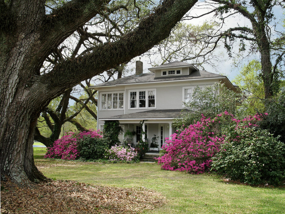
I like the subtlety of this addition. I wish I could see more from the other side and get closer to the details of the addition. On the second floor, I like how they replicated the same size windows for consistency.
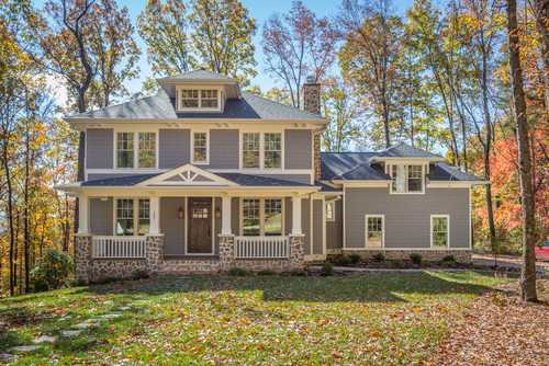
The one-level bump out to the side would make for either a great family room or maybe a garage for this American Foursquare home. Although considering the large windows this addition looks more like a family room. Taking a look at Greenfield Design’s website directly, this home might actually be a complete new build, but I think still provides inspiration for additions.
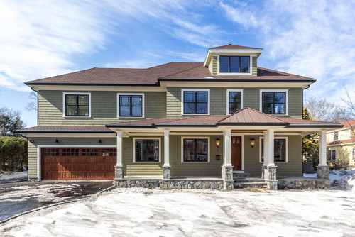
This one took on a two floor bump out with a two-car garage on the first floor and I imagine a bedroom or office on the second floor. I like how they added space in between the garage and old part of the house – perhaps a mudroom or expanded family room? The transition between the original and new portion of the house is seamless. This is one of my favorite American Foursquare home additions.

This American Foursquare home addition is similar to the last with 2 main differences. One, obviously the addition is on the opposite side of the house. And two, the transition area between the original portion of the house and the main area of the addition has a much different design and feel. Instead of blending it has a distinctive bump in (with a handy entrance) that nicely differentiates between the two spaces.

This one also made a second floor addition, but instead of an enclosed garage they created a car port. I like the consistency of the columns on the porch and car port.
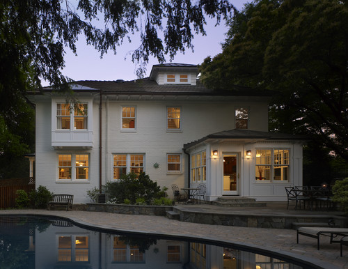
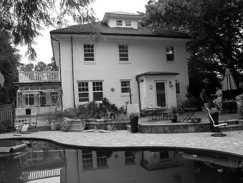
For this renovation, two areas of the home were enlarged. The architect, Coupard Architects and Builders based in Falls Church, VA has a page on their website dedicated to this house with a detailed description and about 11 photos. The following project description is cut and pasted directly from their website.
“The intention of the addition on this 1930’s Four Square brick home was to connect the house to the newly added swimming pool. The hipped roof of the original house had concrete roof tiles so in addition to creating complimenting roof lines, the roof material had to tie into what was there.
For this reason, standing seam metal roofing was chosen and adds accents at the first floor sunroom addition that is adorned with white trim and panels to make a “garden room” and at the second story bay window projection.
Orienting the large double hung windows to overlook the pool from the renovated family room and master suite allow the family to enjoy their yard views year around. The white painted brick ties old and new together seamlessly.
A critical element of the work was the creation of a large Mudroom/Pantry, as well as a “Command Center” on the new back hallway. A Master Bedroom suite occupies the Second Floor addition and a large shed dormer at the rear provides a Bedroom for two brothers.”
Sounds like they added on a lot of great new space!
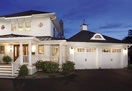
This home only has a garage addition, but I wanted to include for two reasons. One, I thought the garage at an angle was unique. Historically, American Foursquares were built in urban suburbs, which means small lots sizes. Therefore, most Foursquare homeowners don’t have a lot of land to play with. Second, I loved the connector space between the garage and house – likely the mud room. I liked how the porch was extended to include this space with a side door and matching column. It looks like a thoughtfully designed renovation.

This American Foursquare appears to have had additions to both the side and back of the house. I really liked this one and wanted to find additional information on it but couldn’t find info on the architect’s website. It’s a very tasteful addiition. I’m curious what was added and where. Is the first floor addition a new family room? Is the back addition a first floor kitchen expansion and second floor bedroom enhancement?
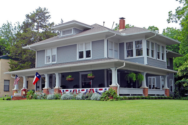
This appears to be another renovation with additions to the side and back. Another one of my favorite American Foursquare additions. That jut out on the second floor with all those windows would be a great way to create a larger master bedroom. It’s a seamless addition, especially with the first floor porch wrapped around the house. (Or maybe I’m totally wrong and that jut out is original to the house…. In any event, it’s still great inspiration). I’d love to see more behind the house and the back addition. Looks like a two floor expansion that provides a lot of room.
This next American Foursquare is a side addition made by William J Martin, owner and architect of WJM Architect based in Westwood, NJ. He added to the left side of his house with a new larger eat-in kitchen and bathroom.
American Foursquare Home Additions – Back
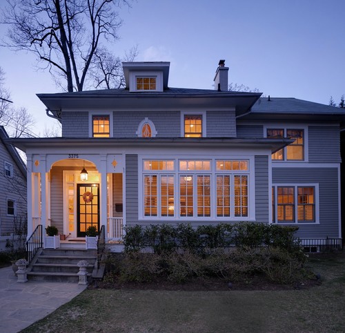
This American Foursquare based in Chevy Chase, MD received an addition when a new owner with three children needed more space. According to the website, they surrounded the existing rooms with a Family Room (to the side) and Kitchen/Breakfast Room (to the rear), the space needs were met, while still maintaining logical movement through the house.
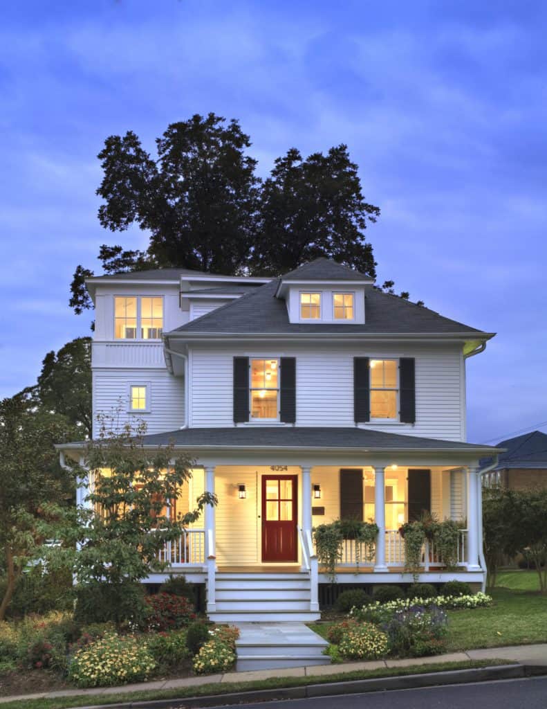
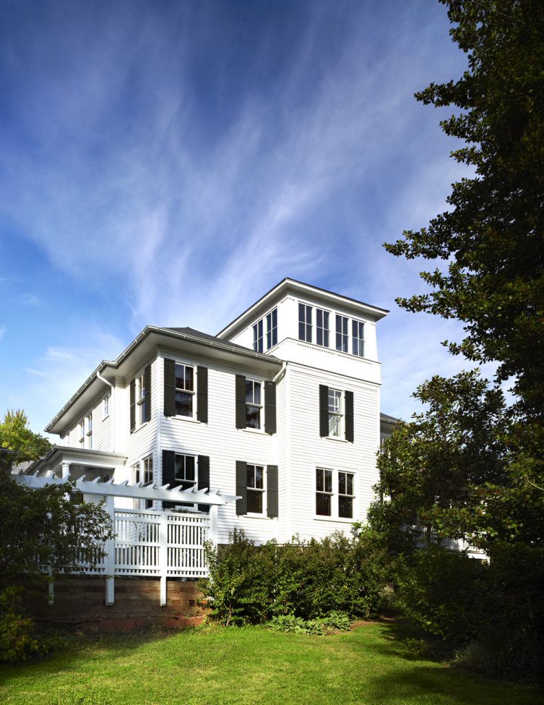
The addition on this American Foursquare in Arlington, VA was featured in This Old House. And to be honest, I didn’t instantly take to this addition. But then I read the whys and hows and looked at the additional photographs on their architect’s website and fell in love.

When the current owners purchased the house they discovered that they had a view of the Washington Monument from their dusty old attic. Working with the architect, they decided to capitalize on that view by doing the following (cut and pasted from the architect’s website):
“A two-story addition, containing a new kitchen and master suite, was placed in the rear yard, where a crumbling former porch and oddly shaped closet addition was removed. The new work defers to the original structure, stepping back to maintain a reading of the historic house. The dwelling was completely restored and repaired, maintaining existing room proportions as much as possible, while opening up views and adding larger windows. A small mudroom appendage engages the landscape and helps to create an outdoor room at the rear of the property. It also provides a secondary entrance to the house from the detached garage. Internally, there is a seamless transition between old and new. “
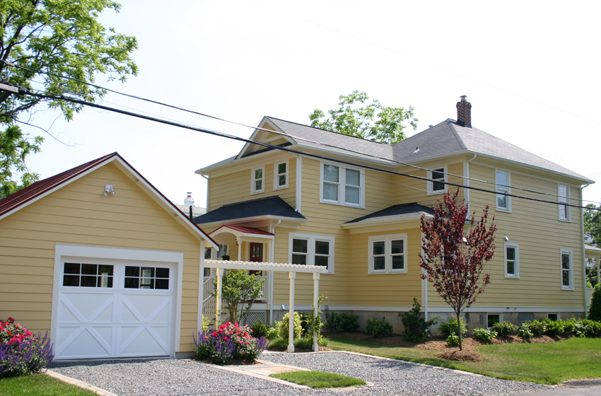
This unique American Foursquare addition won the 2006 Washington Metro DC Chapter Contractor of the Year (CotY) Award from the National Association of the Remodeling Industry (NARI) for Best Historic Renovation. Here’s the project description direct from the architect’s (Bower Design Build) website. There are some great exterior before-and-pics after as well as beautiful interior photos on their site.
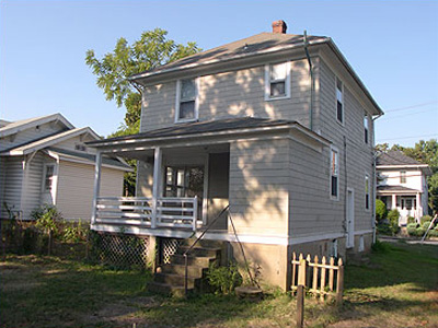
“Not only was a three-level space added to the rear of the home to accommodate a new family room, master bath and basement guest suite, but every aspect of the house was rejuvenated. A larger, well organized kitchen and the addition of a rear foyer/mud-room/laundry room have significantly increased the functionality and value of this home. The detached garage was rebuilt to match the footprint of the original garage (a County requirement since it sat within the set-back zone).
In addition, interior trim was milled on site to match the original, new windows were installed to increase energy efficiency, and the original five panel doors were repaired, refinished, and reused. Original flooring was moved from some areas of the home to be reused in others and new complimentary flooring was installed. The total effect of this renovation is a home that is as warm and welcoming as it was in the 1920s; with all the comforts of a modern day, new, luxury home.”
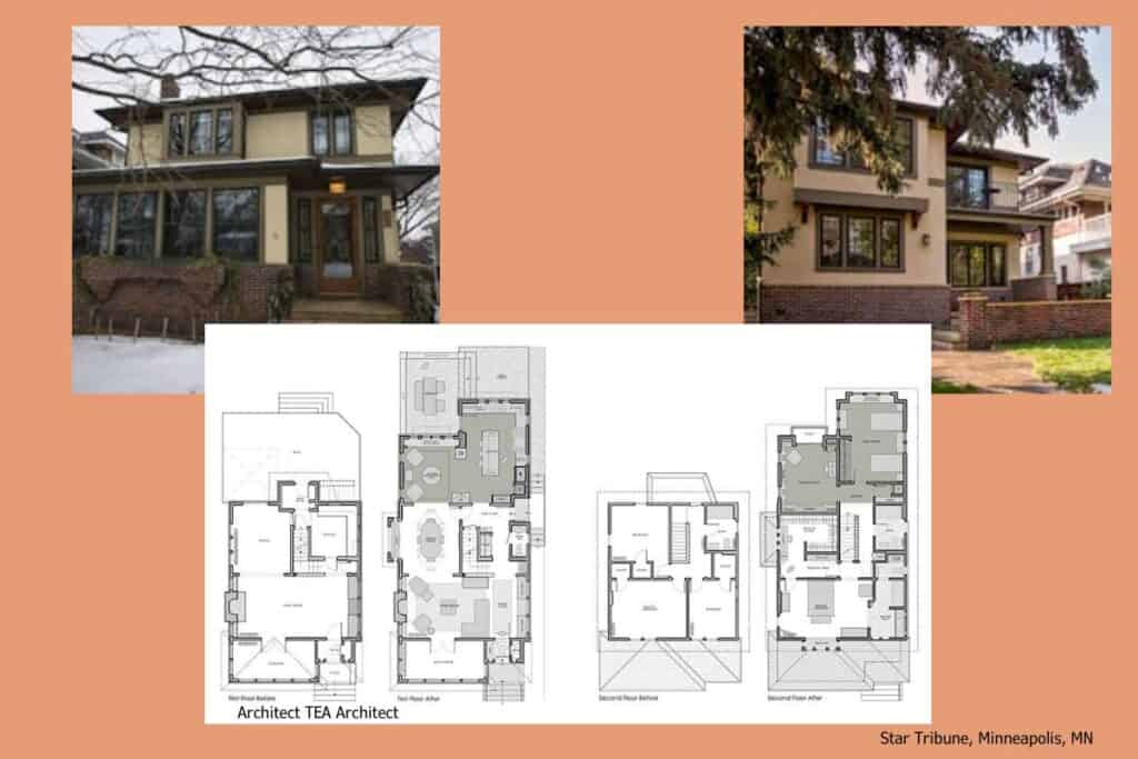
I wish I had a bigger picture of this American Foursquare rear addition. This small picture doesn’t appear to do it justice. The article in the Star Tribune goes into amazing detail about the home, the owners and the renovation, including a host of pictures that made my jaw drop.
A 1925 Prairie-style foursquare’s addition and renovation “delivered modern functionality while enhancing the original character”.
The project consisted of a two-story addition in the rear of the house. This consisted of 450 square feet on the main floor, including a new sitting room and gourmet kitchen. The additional 500 square feet on the second floor included two new bedrooms, with one used as a library/flex space. Existing bedrooms were remodeled to create a master suite with a bath and walk-in closet. Outside, a terrace doubles as an outdoor room.

This addition I also couldn’t find any further information. It looks like this back addition wraps around from one side of the house all the way to a garage on other side. I thought it was interesting that for how big the addition it appears that all 3 of the original sides of the Foursquare were left intact. And I like bonus porch towards the back of the house that connects to the new part. It looks like a natural transition.
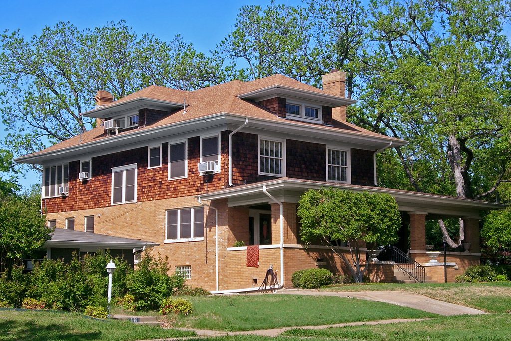
The footprint of this house is probably original but I was compelled to include. This style could be a very simple and viable option for some Foursquare owners. Couldn’t you just add length to the back of the house? Sure it might be a bit bland, but it would look original and the design might be cost effective.
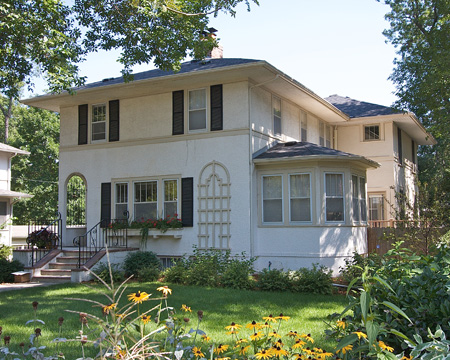
This American Foursquare home received a new rear family room and master bedroom suite addition, which blended seamlessly with the old character of the home. The architect’s website (Foundation Architects) also has a few photos of the interior with charming built-ins and fireplace.
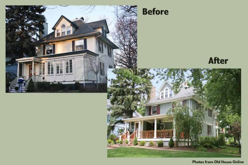
The owners of this 1904 American Foursquare in Westfield, N.J., wanted to re-envision the back on their home. Originally, the house had one odd addition—the only downstairs bathroom. And there was no sense of the backyard from rooms in the house.
Ultimately the project morphed into a complete interior renovation, which included an expanded kitchen and a beautiful back facade with double porches and welcoming yard.
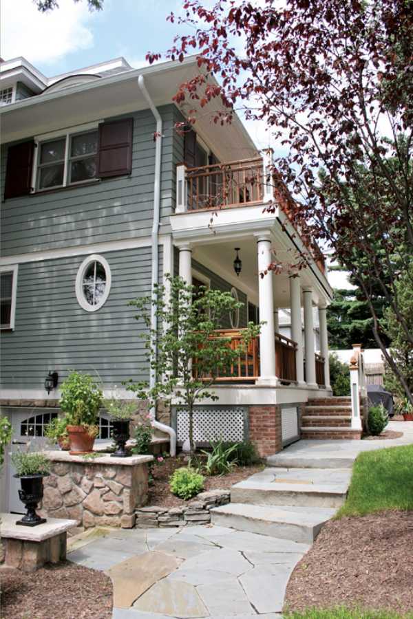
I couldn’t find any information on this next addition but it looks like a great alternative to the previous example. The back of this house was bumped out with the addition of French doors to a welcoming outdoor space at ground level and a cozy sitting porch on the second floor.
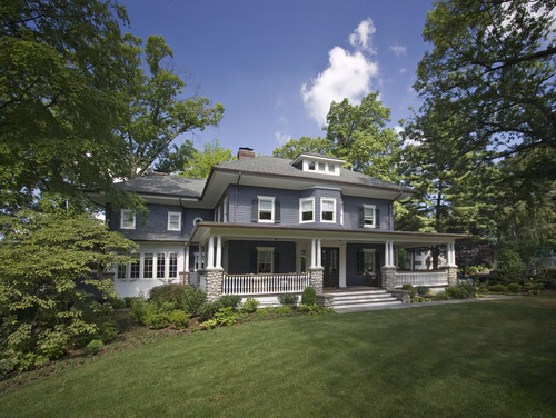
This one is for all the American Foursquare owners who bought their house already with a less-than-desirable addition that they would love to re-do. This house in Ridgewood, NJ was a traditional Foursquare, but had already survived an ineffective addition and and, uh, well, to put it nicely, an interesting style change? As per the website, “its Mission-shaped roof parapet, oppressive dark porch and interior trim, together with an unfortunate addition did not foster a cheerful lifestyle”.

Here’s the project details. “The exterior and landscaping of this 100+ year old home were altered, renovated and given a small addition, all based on the precedent set by surrounding homes in the neighborhood. The interior was renovated and updated to reclaim the inherent beauty of traditional old house living.”
The interior renovation of the main entry foyer and stairs was awarded the Gold Medal for Design Excellence by the American Institute of Architects (AIA). Check it out – the pictures are stunning.
American Foursquare Home Additions – Third Floor
With the American Foursquare’s style of a large (but low) attic I thought that I would find a more examples of third floor or dormer-type renovations. From my amateur perspective, it makes sense to raise the roof a bit and renovate the attic into usable space. (If you are reading this and have ideas why this isn’t common, let me know!)
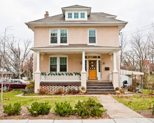
This particular renovation to the attic outside of Washington DC provides a light and airy space on the third floor. It includes an office area, children’s play area and entertainment center. Admittedly, I’m not sure if raising the roof was needed in this particular house or just an addition of a dormer. Check out the pics on Houzz to see the interiors.

This is an interesting one! When this Portland, OR family needed a bit more space LEVER Architecture stepped in with a somewhat unconventional renovation plan. According to Dwell.com, by adding a “fifth square” positioned at a 45-degree angle to the existing roofline, the architects were able to create a generous studio/hang-out space on the house’s third floor. These new windows offer fantastic views of the neighborhood’s rooftops, as well as downtown Portland. Lots of great pics on Dwell’s website including the view from the third floor.
I’ll keep adding photos as I find them. Or follow my Foursquare Additions Pinterest board.
More American Foursquare Articles
Have you added to your American Foursquare? If so, I’d love to add you to the list to help inspire others! Please reach out in the Comment section below or through here.
Want to be the first to know about new posts? Be sure to follow me on Pinterest, Facebook, Instagram or Twitter of even Etsy! Or better yet… Subscribe below!
My monthly (admittedly sometimes more, sometimes less….) emails are like receiving a unexpected letter from an old friend WITHOUT needing to put on your slippers and walk out to your mailbox…. See? I got ya, my friend!)
[Note: My posts are proudly connected to these amazing link parties full of DIY ideas and inspiration!]
